The element
@mattebox/player@0.9.1Needs @mattebox/player-core ^0.6.0 and mattebox ^0.14.0.
This chapter explains <mattebox-player>: its attributes, its properties
and its events. It then explains the controls placed inside it, which show
over the picture under controls="custom".
Attributes
| Attribute | What it does |
|---|---|
src |
Sets the source URL. A new value loads the new source. The same value again loads it again |
type |
Sets the MIME type of the source. Optional when the extension is known |
preset |
Names the engine preset. The default is full |
license-url |
Sets the DRM license URL. The player gives it to engine.drm.setLicenseUrl, or to attachEme for a native session |
certificate-url |
Sets the FairPlay application certificate URL. The player gives it to engine.drm.setCertificateUrl, or to attachEme for a native session. |
native-hls |
off keeps HLS on the engine in Safari. By default Safari plays HLS itself. Changes reload the source |
tooltips |
off hides the name each button shows over itself on hover and keyboard focus. The name is the button’s label, so a translated label translates it |
thumbnails |
Sets a thumbnail track URL. The player gives it to engine.thumbnails.load |
chapters |
Sets a chapters file URL. A session with engine.chapters loads it there. Any other session gets a hidden <track kind="chapters"> on the video. Changing it never reloads |
controls |
Selects the controls: native (the default), custom for the control elements inside the player, or none to hide every child but the video. Changing it never reloads |
subtitle-size |
Sets the subtitle size: small, medium, large or xlarge. The subtitles menu writes it. The default is medium |
subtitle-background |
Sets the subtitle background: none, dark or solid. The default is dark |
layout |
The size tier the controls draw for: compact, regular or wide. The player sets it from its own size. A value you write stays. See Size tiers |
playsinline |
Plays inline on an iPhone. On by default. playsinline="false" lets the iPhone go to fullscreen on play. Changing it never reloads |
autoplay |
Copied onto the video as an attribute |
muted |
Copied onto the video, as an attribute and as the muted state. The player also writes the video’s muted state back to it |
poster |
Copied onto the video as an attribute |
crossorigin |
Copied onto the video as an attribute. A chapters track from another origin needs it |
The player reports its state as attributes on itself, for the page’s
stylesheet and for the controls. mattebox-player[playing] matches while
the video plays.
| State attribute | Set by | While |
|---|---|---|
paused, playing, ended |
The player | The video is in that state |
muted |
The player | The video is muted |
audio |
The player | The source has no picture |
started |
The player | The video has played once since its source was set |
waiting |
The player | The video waits for data |
fullscreen |
The bar, the button | The player is the fullscreen element |
pip |
The picture-in-picture button | The video is in the floating window |
airplay |
The AirPlay button | The video plays on an AirPlay target |
casting |
@mattebox/player-cast |
A Chromecast receiver plays the source, and the video is paused |
idle |
The bar | The bar is hidden after a time without input |
live |
The seek bar | The stream has an availability window |
seekable |
The seek bar | The viewer can seek: VOD, or a live window that is wide enough |
scrubbing |
The seek bar | A pointer holds the seek bar and the video is paused for the drag. The value is the state before the drag, playing or paused, which the play buttons show |
audio comes from the type of the source until the metadata arrives: the
type attribute, or the URL’s extension. After that it comes from the size
of the video. Zero by zero means sound only. The attribute follows a stream
that moves to or from an audio-only rendition.
The player only reports audio. The box stays at 16:9 until the page
changes it, for example with
mattebox-player[audio] video { aspect-ratio: auto; height: 0; }.
Several sources
The player reads <source> children when it has no src attribute. It
tries them in their order, as a video does.
<mattebox-player controls="custom">
  <source
    src="vod/master.m3u8"
    type="application/vnd.apple.mpegurl"
    license-url="https://drm.example/fps"
    certificate-url="https://drm.example/fps.cer"
  />
  <source src="vod/manifest.mpd" type="application/dash+xml" license-url="https://drm.example/widevine" />
</mattebox-player>
Attribute of <source> |
What it does |
|---|---|
src |
Sets the URL of the source |
type |
Sets its MIME type. Optional when the extension is known |
license-url |
Sets the DRM license URL of this source. The player’s own is the default |
certificate-url |
Sets the FairPlay certificate URL of this source. The player’s own is the default |
- The
srcattribute wins over thesourcesproperty, and the property wins over the children. - A source the browser cannot play is replaced by the next one, until the video’s first
playingevent. - Each replaced source dispatches
errorwithfatal: falseand itssource. The last one is fatal. - The player does not read the
mediaattribute of a<source>. - The children are read when a load starts. A
<source>added while nothing is loaded starts a load.
Chapter 02 has the rules of the list.
Properties
| Property | What it is |
|---|---|
player |
The Player of the core |
sources |
The sources to try in order, set from script. Setting it loads. Null returns to the <source> children |
engine |
The engine of the current session, or null |
video |
The <video> inside, in light DOM |
error |
The fatal error of the current load. Null after a load starts and after playback resumes |
markers |
The ranges the page named in this source: see Markers |
Events
The player dispatches the core’s sourcechange and error again as
CustomEvents on itself. They bubble and they are composed. detail is
the core’s payload. When sourcechange fires, engine already returns the
engine of the new session.
player.addEventListener('error', (event) => {
  console.error(event.detail.code);
});
layoutchange fires when the size tier changes. Its detail is the new
tier.
castload comes from the button of @mattebox/player-cast. It fires
before the request goes to the receiver. It bubbles, it is composed, and it
is cancelable. Its detail is the load request of the sender SDK. The page
sets customData on it for its receiver, or cancels the load. See
Casting.
seekkey comes from <mbx-control-bar> when a key would seek: the arrows,
or fast forward and rewind. It fires on the player before the seek, and it
is cancelable. detail.by is the seconds to move, seek-step or its
negative. A cancelled seekkey does not seek. The seek bar cancels it under
key-mode="preview" to aim instead. A page cancels it to seek its own way.
Markers
Markers are ranges of the media that you name from your own content API: the opening and closing credits, a recap, or a part that must not play. No stream format carries credits as a standard, so the page sets them. They work the same for an engine session and a native one.
player.markers.set([
  { start: 0, end: 52, kind: 'opening-credits' },
  { start: 600, end: 630, kind: 'blocked', label: 'Not available for legal reasons' },
  { start: 1380, end: 1440, kind: 'closing-credits' },
]);
kind |
What happens |
|---|---|
opening-credits |
<mbx-marker-button> shows “Skip intro” inside the range |
closing-credits |
<mbx-marker-button> shows “Skip credits” inside the range, unless the player carries upnext |
blocked |
Playback never enters the range: the player moves past its end. The seek bar shows a hollow in the track there, and its preview shows the label, or “Not available” |
| Any other word | <mbx-marker-button> shows “Skip” and the marker’s label |
- Set the markers after
src: a new source clears them. player.markers.listgives them by start, andplayer.markers.within(time)the ones that hold a time.markerschangefires when the list changes, with the list asdetail.blockedfires each time the player moves past a blocked range, with the marker asdetail. Show a notice there if your viewers need one.
Stages
With attributes only, the player uses the preset the preset attribute
names, and full by default. full has every stage the engine ships, so
every control has its namespace and the player plays every kind of source.
A smaller preset or a list of stages downloads fewer bytes, and loses the features of the stages left out. The engine’s guide, chapter 02, has the matrix.
From JavaScript, the constructor and the static define() take a handler
list or a stage list. The page then decides which stages the engine has.
import { MatteboxPlayerElement } from '@mattebox/player';
import hlsCmaf from 'mattebox/protocols/hls-cmaf';
import abr from 'mattebox/stages/abr';

MatteboxPlayerElement.define({ stages: [hlsCmaf(), abr()] });
define() also reaches a player that is already in the page’s markup, as
long as it has not loaded a source yet. A player keeps the stages of its
first load.
config tunes the kernel in the same way. It works with a preset from the
attribute and with a stage list. traceCapacity makes the engine keep its
trace for engine.error, and bufferGoalSeconds sets the buffer goal.
Every member of the engine’s KernelConfig is accepted. With a handler
list, the config goes on the handler.
MatteboxPlayerElement.define({ config: { traceCapacity: 500 } });drm sets the DRM of a native session. It takes the options of
attachEme from mattebox/eme. See Native HLS in Safari.
Native HLS in Safari
Safari plays an HLS source itself, through video.src. The engine does not
run. FairPlay, AirPlay, Low-Latency HLS and the iPhone’s fullscreen then work
as Apple built them.
The player prefers native HLS when all of these hold:
- The source is HLS.
navigator.vendorstarts withApple. Every browser on WebKit reports it.video.canPlayType('application/vnd.apple.mpegurl')is not empty.
Android Chrome also answers canPlayType for HLS. The vendor check keeps it
on the engine. DASH stays on the engine in every browser.
native-hls="off" keeps HLS on the engine. A page with its own handlers
decides the order itself.
A native session has no engine, so player.engine is null. The controls
read the video instead:
| Control | In a native session |
|---|---|
mbx-audio-menu |
Lists video.audioTracks. A choice sets enabled |
mbx-subtitles-menu |
Lists the subtitles and captions tracks of video.textTracks. A choice sets mode |
mbx-drm-badge |
Reads session.eme.drm when the session attached DRM |
mbx-chapters-menu |
Reads the chapters track of the video, as for any session |
mbx-quality-menu |
Hidden. Safari picks the rendition |
mbx-scan-button |
Hidden |
| Thumbnails and previews | None |
A menu hides when the browser has no such list. Forced subtitles show by
Safari’s own choice. A captions track carries the SDH badge. An audio
track of kind description carries the AD badge.
Errors are the video’s MediaError codes, plus the DRM errors of the
attachment.
DRM in a native session
The player attaches the engine’s DRM to the video before it sets src, with
attachEme from mattebox/eme. It detaches it when the session ends.
- The key systems are the
eme-fairplayandeme-cencstages of the engine’s stack: the preset’s, or thestagesoption’s. license-urlsets the license URL, andcertificate-urlthe FairPlay certificate.- The
drmoption adds to them:keySystems,licenseUrl,licenseUrls,requestHook. - The engine’s request hooks do not apply.
requestHookrewrites the license and certificate requests. - A browser without EME attaches no DRM, as for the engine.
FairPlay needs the application certificate:
import { MatteboxPlayerElement } from '@mattebox/player';
import emeFairplay from 'mattebox/stages/eme-fairplay';

MatteboxPlayerElement.define({
  drm: {
    keySystems: [emeFairplay({ certificateUrl: 'https://drm.example/fps.cer' })],
    licenseUrl: 'https://drm.example/fps',
    requestHook: (request) => {
      request.headers.Authorization = `Bearer ${token}`;
    },
  },
});
The controls
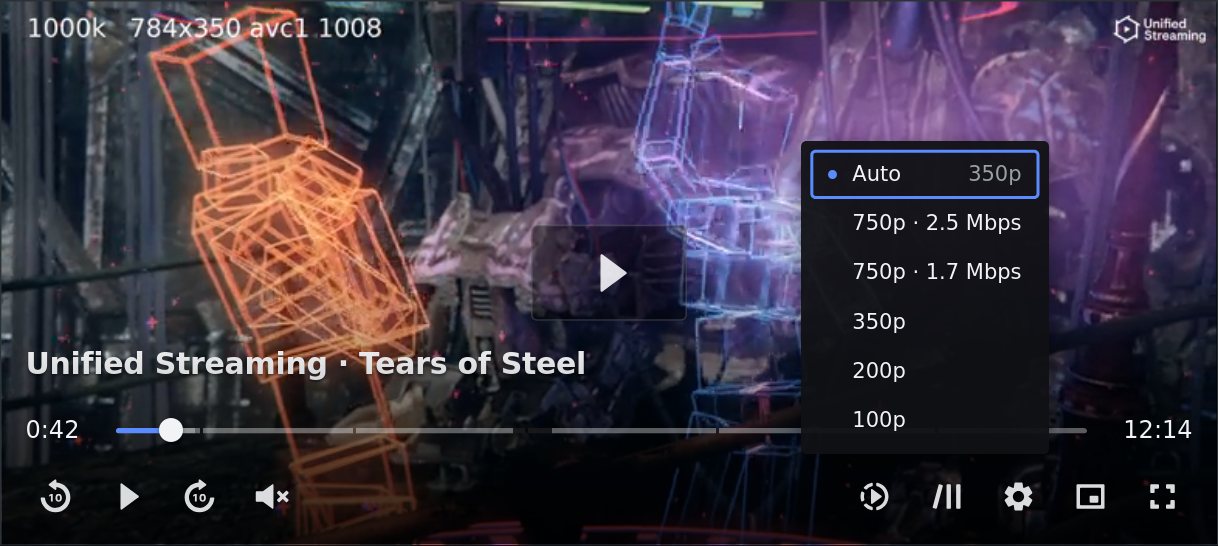
controls="custom" removes the browser’s controls from the video. The
controls are then elements placed inside the player, next to the video.
The bar shows its children in their order. A control left out does not appear. Each control takes its parameters and its labels as attributes, and its icon through a slot.
<mattebox-player src="…" controls="custom">
  <mbx-title></mbx-title>
  <mbx-start-button></mbx-start-button>
  <mbx-marker-button></mbx-marker-button>
  <mbx-error-screen></mbx-error-screen>
  <mbx-spinner></mbx-spinner>
  <mbx-control-bar>
    <mbx-current-time></mbx-current-time>
    <mbx-seek-bar></mbx-seek-bar>
    <mbx-duration></mbx-duration>
    <mbx-play-button label-play="Reproduir" label-pause="Pausa"></mbx-play-button>
    <mbx-skip-button seconds="15"></mbx-skip-button>
    <mbx-spacer></mbx-spacer>
    <mbx-fullscreen-button>
      <svg slot="icon-enter" viewBox="0 0 32 32">…</svg>
    </mbx-fullscreen-button>
  </mbx-control-bar>
</mattebox-player>
The player appends nothing under custom. A player with no controls
inside stays empty, so the composition is always the page’s. A composition
to start from, with most of the controls:
<mbx-title></mbx-title>
<mbx-start-button></mbx-start-button>
<mbx-error-screen></mbx-error-screen>
<mbx-spinner></mbx-spinner>
<mbx-control-bar>
  <mbx-current-time></mbx-current-time>
  <mbx-seek-bar></mbx-seek-bar>
  <mbx-duration></mbx-duration>
  <mbx-live-button></mbx-live-button>
  <mbx-skip-button seconds="-10"></mbx-skip-button>
  <mbx-play-button></mbx-play-button>
  <mbx-skip-button seconds="10"></mbx-skip-button>
  <mbx-volume></mbx-volume>
  <mbx-spacer></mbx-spacer>
  <mbx-speed-menu></mbx-speed-menu>
  <mbx-chapters-menu></mbx-chapters-menu>
  <mbx-subtitles-menu></mbx-subtitles-menu>
  <mbx-audio-menu></mbx-audio-menu>
  <mbx-quality-menu></mbx-quality-menu>
  <mbx-airplay-button></mbx-airplay-button>
  <mbx-pip-button></mbx-pip-button>
  <mbx-fullscreen-button></mbx-fullscreen-button>
</mbx-control-bar>
The bar has two rows: the seek row above the buttons row.
- A child with
slot="seek"goes in the seek row. - The times, the seek bar and the live button go in the seek row by themselves, unless the page wrote a
sloton them. - Every other child goes in the buttons row, in its order.
<mbx-spacer>pushes the controls after it to the right.
Import only what you use
The root entry registers every element, and the CDN bundle contains them all. A page on a bundler imports the player alone and one entry per control it places. The bundle then contains only those controls.
import '@mattebox/player/element';
import '@mattebox/player/elements/control-bar';
import '@mattebox/player/elements/play-button';
import '@mattebox/player/elements/seek-bar';
Each control entry registers its element and the player.
An element the page did not import renders nothing.
The elements
Each element reads and writes the video from outside, as a page would. It reads the engine’s namespaces through the player.
An element that reads a namespace hides while the session has none. A native session shows no quality menu and no live button. Its audio and subtitles menus read the video’s own track lists. See Native HLS in Safari.
| Element | Attributes | Labels | Icon slots | What it does |
|---|---|---|---|---|
mbx-control-bar |
idle-ms, seek-step |
Lays out the controls over the picture. It fades, handles the shortcuts and the click on the video, and moves the subtitles above itself | ||
mbx-spacer |
Takes the free room in a row | |||
mbx-play-button |
label-play, label-pause, label-replay |
icon-play, icon-pause, icon-replay |
Plays and pauses. Replays after the end | |
mbx-mute-button |
label-mute, label-unmute |
icon-mute, icon-low, icon-high |
Mutes and unmutes. The icon shows the level. Sets aria-pressed |
|
mbx-volume-slider |
step, page |
label |
Sets the volume. It shows zero while muted, and a level above zero unmutes. Has dragging during a drag |
|
mbx-volume |
Groups the mute button with a slider that unfolds under the pointer or on focus. It fills itself with both when left empty | |||
mbx-skip-button |
seconds, negative for back |
label with {seconds} |
icon |
Moves the playhead by seconds, within the range the video can seek |
mbx-scan-button |
direction, forward or backward; rates, space-separated, each above 2 |
label |
icon |
Scans through the I-frame track with engine.trick.setRate. Each press steps up through rates, and a press past the last plays at normal speed. Hidden without an I-frame track. Has scanning and aria-pressed while it scans |
mbx-current-time |
Shows the position, such as “1:23”. On live, it shows the wall clock or the distance behind the edge. Hidden on a live stream that is not seekable | |||
mbx-duration |
Shows the duration, such as “4:56”. Hidden on live | |||
mbx-remaining-time |
Shows the time left, such as “-4:53”. Hidden on live. The one for a bar that shows a single number | |||
mbx-seek-bar |
step, page, live-window, chapters, scrub, preview, key-mode |
label, label-of with {current} and {duration}, label-behind with {time}, label-blocked |
Shows the position, the buffered ranges, the live window and its edge, and the preview. It is divided at the chapters, and the preview names the chapter. chapters takes divided, titles, both (the default), or none. A drag scrubs through the I-frame track when there is one. scrub="false" turns that off. preview orders the preview’s picture sources, frames tiles by default. key-mode="preview" makes the keys aim a target instead of seeking. Sets live, seekable and scrubbing on the player. Has dragging during a drag |
|
mbx-live-button |
text, label-live, label-at-edge |
Shows on a live stream and seeks to the edge. Disabled at the edge, where it has at-edge |
||
mbx-speed-menu |
rates, space-separated |
label, label-normal, label-back with {page} |
icon |
Sets video.playbackRate. Works for every session |
mbx-chapters-menu |
label, label-back |
icon |
Lists the chapters with their start times, and checks the current one. Each item shows the chapter’s picture when every chapter has one. A choice seeks. Hidden without chapters. Works for every session | |
mbx-quality-menu |
label, label-auto, label-back |
icon |
Pins a rendition through engine.quality. Auto means no pin |
|
mbx-audio-menu |
label, label-back, label-ad, label-original, label-track |
icon |
Selects the audio track through engine.tracks, or video.audioTracks in a native session. Lists only tracks the engine can play. Shown when there is more than one. Marks an audio description track and the original language with a badge |
|
mbx-subtitles-menu |
label, label-back, label-off, label-track, label-settings, label-size, label-background, label-small, label-medium, label-large, label-xlarge, label-none, label-dark, label-solid, label-sdh, label-cc |
icon, icon-on |
Selects the text track, or off, through engine.tracks, or video.textTracks in a native session. Lists only tracks the engine can play, in-band captions included. Forced tracks are not listed, and the menu reads off while one shows. Marks SDH subtitles with a badge. Its Settings page sets the size and the background, and writes subtitle-size and subtitle-background on the player |
|
mbx-drm-badge |
label with {system} and {keys}, label-key and label-keys with {count} and {statuses}, label-no-key |
icon |
Shows a lock for engine.drm, or session.eme.drm in a native session, with a tooltip on hover and on focus |
|
mbx-airplay-button |
label, label-active |
icon, icon-active |
Opens Safari’s AirPlay picker. Hidden without AirPlay and while the video offers no target. Sets airplay on the player |
|
mbx-pip-button |
label-enter, label-exit |
icon-enter, icon-exit |
Toggles picture in picture. Hidden without the API. Sets pip on the player |
|
mbx-fullscreen-button |
label-enter, label-exit |
icon-enter, icon-exit |
Toggles fullscreen on the player. Hidden without the API. Sets fullscreen on the player |
|
mbx-start-button |
label-play, label-replay |
icon-play, icon-replay |
Shows a large play button over the picture while paused, and a replay after the end. Hidden while playing, behind an error, and in a box too short to keep it above the bar | |
mbx-marker-button |
label-opening-credits, label-closing-credits, label-skip |
Shows a skip button over the picture inside a marker the page set, other than blocked. A press moves to the marker’s end. It sits above the bar, and hides once the media has ended. While the player carries upnext, a card such as the playlist’s <mbx-up-next> covers the closing credits, and the button leaves them to it |
||
mbx-error-screen |
label-title, label-retry |
Shows a fatal error over the picture, with the category, the code and a retry that loads src again |
||
mbx-spinner |
label |
icon |
Shows a turning ring in the place of the start button while the player has waiting |
|
mbx-title |
heading, subheading, artwork |
Shows the artwork next to the heading and subheading, above the bar. Beside artwork, a long heading wraps to three lines, or two above a subheading; without artwork it keeps one line. Shown while the video is paused, including before the first play. Has playing for the page’s own rule |
The title’s content comes from its attributes, because the stream has none of it. It goes first among the screens, so its band paints under the start button and the spinner.
CSS decides when the title shows. By default it shows while the video is paused, which includes the time before the first play.
mattebox-player[started] mbx-title { display: none }shows it only before the first play, like the poster.mattebox-player:hover mbx-title { display: flex }shows it again on hover.
Every menu has open on itself while its popup shows. The bar does not
fade while an element inside it has open.
A popup never leaves the picture. It uses the room above its button as its height, and scrolls when it needs more.
Casting
Chromecast is @mattebox/player-cast, a package of its own. Its button
loads Google’s sender SDK onto the page, and the player never loads
third-party code for a page. The AirPlay button uses Safari’s own API, so
it is part of the player.
Install the package and place its two elements, the way <mbx-diagnostics>
is placed.
<mattebox-player src="…" controls="custom">
  <mbx-cast-screen></mbx-cast-screen>
  <mbx-control-bar>
    …
    <mbx-cast-button></mbx-cast-button>
  </mbx-control-bar>
</mattebox-player>

<script type="module">
  import '@mattebox/player';
  import '@mattebox/player-cast';
</script>
<mbx-cast-button> starts and ends a Chromecast session.
<mbx-cast-screen> controls the receiver during the session.
The button loads the SDK from gstatic the first time it connects. It does
not load the SDK when the page already has it, or when the button has
sdk="none". In that case the page loads the SDK.
receiver is the id of the receiver application. Without it, the button
uses the Default Media Receiver. The first button on the page decides the
receiver, because the SDK keeps one context per page.
| Element | Attributes | Labels | Icon slots |
|---|---|---|---|
mbx-cast-button |
receiver, sdk |
label-start, label-stop |
icon, icon-active |
mbx-cast-screen |
label with {device}, label-stop, label-play, label-pause, label-seek |
icon-play, icon-pause |
When a session starts, the player does this:
- It pauses the video.
- It suspends the engine, so the engine requests nothing during the cast.
- It sends the source of the session at the video’s current time, with the subtitle tracks of the video, and
LIVEfor a live stream. - It sets
castingon itself. The default stylesheet then hides the bar and the start button, and the cast screen shows the receiver’s controls.
When the session ends, the engine resumes. The video seeks to the time where the receiver stopped, and plays if the receiver was playing. A live stream returns to the live edge instead.
The receiver plays the URL by itself, so DRM and signed URLs are the page’s
to arrange, in castload. The Default Media Receiver plays clear HLS and
DASH. A protected stream needs a receiver of the page’s own, which reads
what the page put in customData.
button.addEventListener('castload', (event) => {
  event.detail.customData = { licenseUrl: 'https://drm.example/widevine' };
});
Labels
Every text a control shows, and every name it gives itself, is an attribute
of that control. English is the value when the attribute is absent. Each
state has its own attribute: label-play, label-pause, label-replay.
A label can contain a value in braces: label="Enrere {seconds} segons". A
name in braces the control does not know stays as written.
Translation is the page’s, with whatever it uses for its strings. The player ships no locales.
<mbx-play-button label-play="Reproduir" label-pause="Pausa" label-replay="Torna a reproduir"></mbx-play-button>
<mbx-skip-button seconds="-10" label="Enrere {seconds} segons"></mbx-skip-button>
<mbx-seek-bar label="Cerca" label-of="{current} de {duration}"></mbx-seek-bar>
The audio and subtitles menus name a track by the first of these it has:
- The name in the manifest (HLS
NAME, DASHLabel), or the label of a native track. - The language’s name in the page’s language (
langon<html>, else the browser’s). This needsIntl.DisplayNames, which Chromium 76 and 79 do not have. - The language code.
- “Track” (
label-track) and the track’s place in the list.
The role main is not shown. Two tracks that read the same take a hint in
parentheses: the audio channel layout (“Stereo”, “5.1”) when the engine
gives one, then the role, then the place in the list.
A badge after the name marks a standard characteristic, from the engine’s track functions.
| Badge | Attribute | Menu | Track |
|---|---|---|---|
AD |
label-ad |
audio | Audio description |
Original |
label-original |
audio | The original language |
SDH |
label-sdh |
subtitles | Subtitles for the deaf and hard of hearing |
CC |
label-cc |
subtitles | Closed captions carried in the video |
The player draws AD, SDH and CC as a glyph. The label is the glyph’s
tooltip, and the text a screen reader says.
The quality menu lists engine.quality.selectable, best first: what the
browser can play, one entry per video stream. A name grows only as far as
it must to tell entries apart.
- The height, such as
1080p, or the bitrate without one. - The frame rate above 30, such as
1080p60. Dolby VisionorHDR, such as1080p HDR.- The bitrate, when two entries still read the same:
1080p60 · 6.2 Mbps. - The codec, when they still do:
1080p · 6.1 Mbps · HEVC.
Entries that read the same after that, such as one stream on two CDNs, show once.
Under Auto, the Auto row names what plays in its detail, such as Auto 720p. These names come from the stream and have no attribute.
Icons
Every button has one named slot per state for its icon. The button shows its own icon when the slot is empty.
A page puts its own SVG in the slot. The button keeps its name: the icon is
decoration with aria-hidden, and the name is on the button, where a
screen reader reads it.
<mbx-play-button>
  <svg slot="icon-play" viewBox="0 0 24 24"><path d="…" /></svg>
  <svg slot="icon-pause" viewBox="0 0 24 24"><path d="…" /></svg>
</mbx-play-button>
The player’s own icons are Mattebox’s drawings: one filled path each, on a 32-unit grid, so they scale to any size and take the text colour.
A control of your own
Any element inside the bar is a control. It shows in the row where the page put it. It finds its player the way the player’s own controls do:
- The nearest
mattebox-playerabove it, through shadow hosts. Wait forcustomElements.whenDefined('mattebox-player')before reading it. player.videofor playback,player.enginefor the namespaces (null for a native session),player.playerfor the core, andplayer.error.sourcechangeon the player for a new session,errorfor a failure.openon itself while it shows a popup, so the bar does not fade.- A real
<button>for anything Space must activate. The bar leaves Space to a focused button.
A control gets nothing else, and the player’s own controls use nothing else. A control of the player that needed more would be a bug in this API.
@mattebox/player-diagnostics and @mattebox/player-cast are controls
written this way, in packages of their own. Chapter 05 covers the
diagnostics, and Casting covers the cast.
The bar
The bar fades on one timer. Any pointer movement or press, any key, and the
start of playback restart the timer for idle-ms. When the timer ends, the
bar hides, except in three cases:
- The video is paused.
- An element inside the bar has
open. - Keyboard focus is inside the bar.
The bar never tracks whether the pointer is over it. The fade respects
prefers-reduced-motion.
A narrow bar hides controls from its buttons row instead of overflowing.
Each child has a priority, and the bar hides the highest number first:
| Priority | Controls |
|---|---|
| 6 | The scan buttons |
| 5 | The volume slider |
| 4 | The diagnostics, the DRM lock, the speed and chapters menus |
| 3 | The audio and quality menus, picture in picture |
| 2 | The skips |
| 1 | The subtitles menu, the mute button and the volume group |
| 0 | Everything else. Never hidden: play and fullscreen stay at every width |
A priority attribute on a control replaces its default. A page’s own
control in the bar starts at 0.
While the buttons need more room than the row has, minus a few pixels of
tolerance, the bar sets collapsed on the highest numbers, one at a time.
Among equal numbers it starts from the right. It removes the attribute
again when the bar gets wider.
The bar counts the folded volume slider at its unfolded width, so the row has room for the slider when it unfolds. The slider is the first control to go.
collapsed is an attribute, and one rule of the bar hides a collapsed
control. mbx-speed-menu[collapsed] is therefore the page’s to style. A
page with its own breakpoints sets every priority to 0 and writes container
queries on the player.
Fullscreen goes on the player itself. Every control placed inside stays
visible, and mattebox-player:fullscreen matches. The player also sets
fullscreen on itself, for the Safari versions that only have the prefixed
API. mattebox-player[fullscreen] > video is where a page lifts a height
limit it set on the video.
The subtitles are the browser’s own cues on the video. The bar moves the active cues above itself while it shows. When it hides, they rest one line above the picture’s bottom edge. It only moves a cue the author did not position. Two cues that show at once stack, each by its measured height.
The bar styles the cues with a small stylesheet it adds to the document
once, with one rule per size and one per background. The stylesheet must be
in the document: ::cue only accepts rules from the document that holds
the video, and it accepts no custom properties.
The sizes are percentages of the browser’s own cue size, which follows the
height of the video. A page that wants more writes its own
mattebox-player > video::cue rule. That rule wins because it comes later.
On a live stream, the seek bar shows the availability window and marks the edge. The live button seeks to the edge on a click. The time and the hover preview show the wall clock when the stream has an anchor (a program date time or an availability start). Otherwise they show the distance behind the edge.
A window shorter than live-window buffer goals gets no seek bar, because
the viewer has no range to seek in. The live button then stays red and
disabled.
Every control is reachable with the keyboard, and every control has a name. The sliders announce their value in words. While focus is inside the player, these keys work from every control:
| Key | What it does |
|---|---|
Space, k |
Plays or pauses. Space on a focused button activates that button |
m |
Mutes or unmutes |
f |
Enters or leaves fullscreen |
| Left, Right | Seeks by the seek-step of the bar |
| Play/Pause, Play, Pause | The media keys a remote or a keyboard sends: play or pause |
| Stop | Pauses. The source stays |
| Fast Forward, Rewind | Seek by the seek-step of the bar |
| Up, Down, Page keys, Home, End | On a slider, moves it by its step, by its page, or to its end |
| Up, Down, Home, End, Escape | In a menu, moves the selection. Escape closes the menu |
A click on the video plays or pauses. Under custom the player sets
tabindex="0" on itself, so the shortcuts still work after a click on the
video. A page that set its own tabindex keeps it.
A key another handler already prevented is left alone. A handler that listens on the player in the capture phase runs first, and takes a key by preventing it.
Native controls
Under controls="native", the video shows the browser’s own controls and
the player appends nothing. The quality, the tracks and the rest have no
control, because the browser’s controls do not show them. A page that
wants them uses controls="custom".
Under native controls, a fatal error shows in the player’s own row under
the video, the error surface, with the category, the code and a retry.
Under custom, <mbx-error-screen> shows the error instead.
controls="none" takes the browser’s controls off the video, appends
nothing, and hides every child but the video. A page keeps its composition
in place and turns it off with the one attribute. The bar’s shortcuts still
listen while hidden, and the error surface still shows a fatal error.
The live button needs more than its namespace. full has both live stages,
so engine.live exists for a VOD stream too. A stream is live when it has
an availability window, so the button shows only after edge is set.
Native controls do not report the scrub position, so thumbnails have no preview there.
- Under
controls="native", thethumbnailsattribute loads the track and the player draws nothing. The app callsengine.thumbnails.at(time). - Under
controls="custom", the preview of the seek bar shows a picture above the pointer, scaled to--mbx-preview-width, 160px by default.
On a TV, a seek per key press stutters. key-mode="preview" on the seek
bar makes the keys aim instead:
- The arrows, Page Up, Page Down, Home, End, fast forward and rewind move a target. The thumb and the preview show it, and the video keeps playing.
- A held key’s step grows, so a long film takes seconds to cross.
- Enter seeks to the target. So does moving focus off the bar, or a second without a key.
- Escape, Back, or a click outside the seek bar drops the target.
The default, key-mode="instant", seeks on every key.
The preview’s picture comes from the sources the seek bar’s preview
attribute names, in order of preference. The first one that answers for
the time wins. Without a picture, the preview shows the time and the
chapter.
preview |
Picture |
|---|---|
frames tiles (default) |
The decoded I-frame; the tile until it arrives, or without one |
tiles frames |
The tile; the decoded I-frame where the stream has no tile |
tiles |
The tile only |
frames |
The decoded I-frame only |
none |
No picture |
A decoded I-frame comes from engine.trick.frameAt. It needs an I-frame
track, WebCodecs, and clear fMP4. A tile comes from engine.thumbnails.
A drag on the seek bar scrubs when the session has an I-frame track. The
video pauses and shows the I-frame at each position, and the release seeks
there. scrub="false" on the seek bar turns this off. Without scrubbing,
the video pauses and seeks as the pointer moves, and
the release resumes playback if it was playing. Thumbnail tiles never drive a drag:
they are previews, not frames of the video.
<mbx-scan-button> shows only with an I-frame track. Place one of each
direction around the play button:
<mbx-scan-button direction="backward"></mbx-scan-button>
<mbx-play-button></mbx-play-button>
<mbx-scan-button></mbx-scan-button>
Chapters come from the engine when the session holds some, and from a text
track of kind chapters on the video otherwise. There are four ways to add
them:
- The
chaptersattribute with a URL. A session withengine.chaptersloads it there, in every format the engine reads. Any other session gets a hidden<track>. - The manifest. The engine reads the chapters an HLS playlist names.
engine.chapters.set(list)with chapters the page already holds, such as ones from a content API.- A
<track>on the video written by the page, or a track built withaddTextTrack.
The seek bar leaves a gap at each chapter boundary and names the chapter in
the preview. <mbx-chapters-menu> lists the chapters, with their pictures
when every chapter has one. Chapters work for a native session too, from a
text track.
<mattebox-player src="https://example.com/vod/master.m3u8" chapters="/vod/chapters.vtt" controls="custom"></mattebox-player>Styling
The controls are elements in the page’s own light DOM. The page’s
stylesheet selects each one by its tag: mbx-play-button { margin: 0 4px }.
The inside of a control is in shadow DOM. ::part() reaches it, and
accepts every CSS property. The state is an attribute on the element, so a
selector can read it.
mbx-play-button::part(button) { border-radius: 50%; }
mattebox-player[playing] mbx-play-button::part(icon) { fill: rebeccapurple; }
mbx-quality-menu::part(item):hover { background: rebeccapurple; }
mbx-live-button[at-edge]::part(dot) { box-shadow: none; }
mbx-control-bar { background: #000; }
Two rules make this work:
- No stylesheet of the player uses
!important. For normal declarations, a rule from the page wins over a rule from the shadow tree, whatever its specificity. An!importantinside the shadow tree would reverse that. - Every element a control draws has a
part, because::part()cannot select the descendants of a part.
| Element | Parts |
|---|---|
mattebox-player |
stage, and the error surface: error, error-category, error-code, error-retry, value, button |
mbx-control-bar |
row, seek-row, buttons-row |
| Every button control | button, icon |
mbx-volume-slider, mbx-seek-bar |
slider, rail, track, fill, thumb |
mbx-seek-bar |
buffered, buffered-range, blocked, blocked-range, hover, edge, preview, preview-frame, preview-image, preview-tile, preview-title, preview-time |
mbx-scan-button |
button, icon, rate |
mbx-live-button |
button, dot, text |
| Every menu | button, icon, popup, title, section, section-label, item, item-image, item-badge, item-glyph, badge-text, item-detail, page-item, glyph-item, back-item, and <name>-item and <name>-section per group |
| The chosen item of a menu | checked, added to the part of the item. It is the only state in a part name, because a page cannot otherwise select the state of an item inside a shadow root |
mbx-drm-badge |
icon, tooltip, tooltip-title, tooltip-text |
mbx-error-screen |
box, title, detail, category, separator, code, retry |
Part names are public API. A release can add names. A name is only renamed in a major version.
Size
Every size in the controls is an em of the player’s font size, which is 16 pixels. One rule scales the whole interface: the buttons, the bar, the text, the menus.
mattebox-player {
  font-size: 20px;
}
Borders and outlines stay one or two pixels at every size.
Size tiers
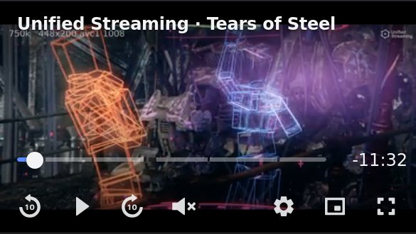
The player measures its own box and sets layout on itself. The controls
draw for that tier. The box decides, not the screen: a small embed on a
desktop page is compact, and a phone in fullscreen is not.
| Tier | When | What the controls do |
|---|---|---|
compact |
Under 480 pixels wide, or under 320 high | One time readout, the time left. The title is one line at the top. Menus and the playlist open as sheets from the bottom of the player, over the controls. A menu’s first row is the way back |
regular |
Between the two | The design at 16 pixels |
wide |
From 1280 pixels wide and 700 high | The same design at 20 pixels, for a TV or a fullscreen |
You write the same markup for all three. A stylesheet reads the tier from the player, and every control carries it too:
mattebox-player[layout="compact"] mbx-skip-button {
  display: none;
}
To fix the tier, write the attribute. The player then leaves it alone. Remove it to hand it back.
<mattebox-player layout="compact" src="…"></mattebox-player>A font size of your own on the player wins over the tier’s.
Tokens
Custom properties set on the player are inherited by every control:
--mbx-surface, --mbx-text, --mbx-muted, --mbx-accent, --mbx-error,
--mbx-radius, --mbx-gap, --mbx-pad, --mbx-font, --mbx-live,
--mbx-preview-width (in pixels, 10em by default), --mbx-menu-max-height (in pixels, 22em by default), --mbx-tooltip (none hides the tooltips), --mbx-blocked (the dashes of a blocked range).
The shadow roots are open. When ::part() is not enough, a page adds a
stylesheet inside a control: control.shadowRoot.append(style) in every
browser, or adoptedStyleSheets in a modern one.
The <video> is in light DOM, so the page styles it directly. By default
it takes the full width at 16:9 until the media’s own ratio is known, so
the box does not change size when the metadata arrives. A page that knows
the ratio of its media sets aspect-ratio on the video.
The box of the player is black, and the picture is centred in it.
- With a height or an
aspect-ratioon the player,object-fit: containletterboxes or pillarboxes the picture inside the box. The bar stays at the bottom of the box, as in fullscreen. - Without a height, the box is as tall as the picture and no black shows.
mattebox-player { background: … }changes the colour.
Browser support
The player is a custom element, so it needs Custom Elements v1: Chrome 54, Safari 10.1, Firefox 63, Edge 79. Every browser has Shadow DOM v1 at or before those versions.
::part() needs Chrome 73, Safari 13.1, Firefox 72. An older browser still
applies the custom properties above.
The engine supports older browsers than the player: it needs ES2015 only.
A page for a browser the player does not support takes
@mattebox/player-core and writes its own UI.
Lifecycle
disconnectedCallback disposes the session. Reconnecting loads src
again.
A control attaches when it is connected inside a player, and detaches when it is removed. A framework that reorders or replaces children is therefore safe.
Example
A player with its own bar in Catalan, its own play icons, and a control the page wrote.
<mattebox-player src="https://example.com/vod/master.m3u8" controls="custom">
  <mbx-start-button label-play="Reproduir"></mbx-start-button>
  <mbx-error-screen label-title="Error de reproducció" label-retry="Torna-ho a provar"></mbx-error-screen>
  <mbx-control-bar>
    <mbx-current-time></mbx-current-time>
    <mbx-seek-bar label="Cerca" label-of="{current} de {duration}"></mbx-seek-bar>
    <mbx-play-button label-play="Reproduir" label-pause="Pausa">
      <svg slot="icon-play" viewBox="0 0 24 24"><path d="M8 5v14l11-7z" /></svg>
      <svg slot="icon-pause" viewBox="0 0 24 24"><path d="M6 5h4v14H6zm8 0h4v14h-4z" /></svg>
    </mbx-play-button>
    <mbx-volume>
      <mbx-mute-button label-mute="Silencia" label-unmute="Activa el so"></mbx-mute-button>
      <mbx-volume-slider label="Volum"></mbx-volume-slider>
    </mbx-volume>
    <mbx-spacer></mbx-spacer>
    <my-share-button></my-share-button>
    <mbx-fullscreen-button label-enter="Pantalla completa" label-exit="Surt"></mbx-fullscreen-button>
  </mbx-control-bar>
</mattebox-player>

<script type="module">
  import '@mattebox/player';

  class MyShareButton extends HTMLElement {
    async connectedCallback() {
      await customElements.whenDefined('mattebox-player');
      const player = this.closest('mattebox-player');
      const button = document.createElement('button');
      button.type = 'button';
      button.setAttribute('aria-label', 'Comparteix');
      button.textContent = '↗';
      button.addEventListener('click', () => {
        navigator.share({ url: player.getAttribute('src') });
      });
      this.append(button);
    }
  }
  customElements.define('my-share-button', MyShareButton);
</script>